The cold message · freelance· aug 2023
Taking a sales agency from 0 to 1 through strategic web design.
CGI's file upload process was plagued with accessibility issues and a lack of clear usage guidelines. This led to longer onboarding times for new customers and challenges for existing ones. My redesign addressed these pain points which enhanced visual consistency across 7 CGI products and drove a 60% boost in development output.
Team
John - Senior designer / John - Senior designer / John - Senior designer / John - Senior designer
Skills
Design systems / Documentation
Role
UX Design Intern
Timeline
May - August 2023
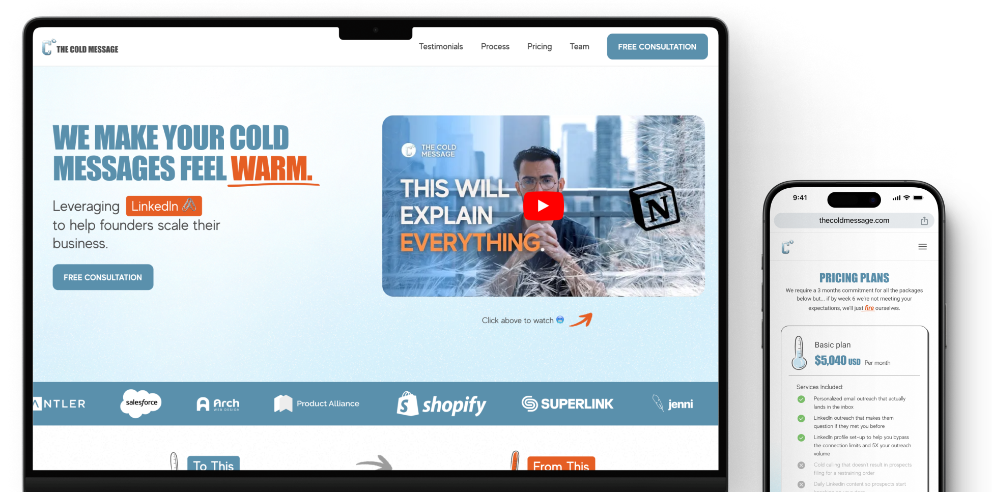
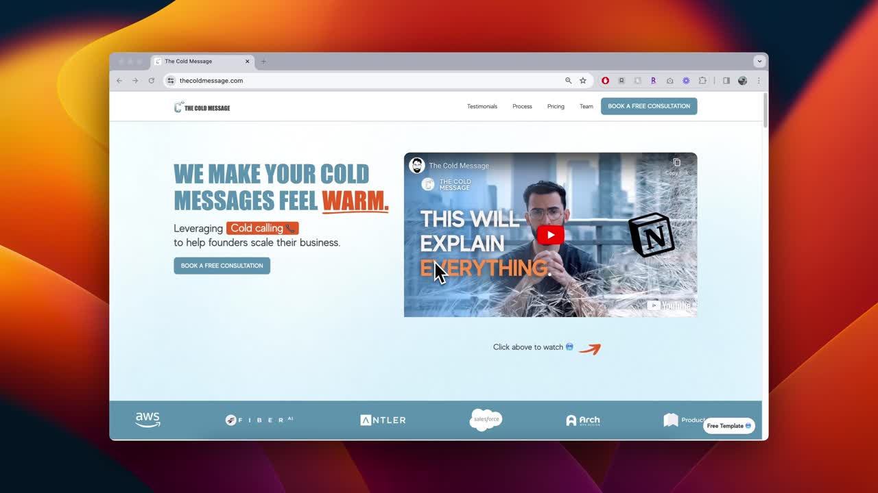
[Problem] The Cold Message lacked a digital presence having no website to call home. [Insight] This led to constant back-and-forths with prospects who had questions about their services, causing friction in scheduling calls. [Solution] I designed and developed a responsive website for the agency, taking them from 0 to 1 in just a month - streamlining client interactions.
Client
Xavier Caffery, founder of The Cold Message
CONTRIBUTIONS
Competitive analysis / User interviews / High-fi desktop + mobile wireframes / Webflow Development
TOOLS
Figma, Webflow
Timeline
August 2023 (1 month)
A highlight reel of the design decisions made to increase conversion and foster user experience.
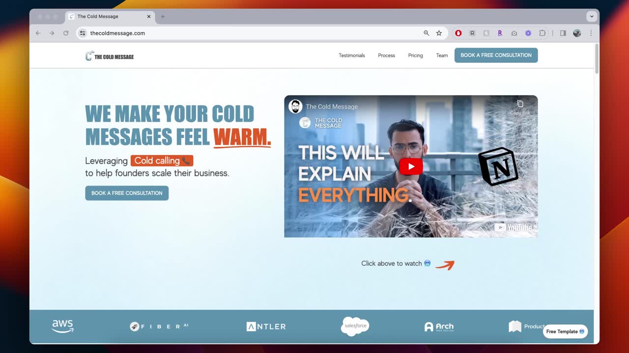
The copywriting in the hero banner summarizes what the agency provides, how they do it, and who their target market is to remove ambiguity.

The nav bar is set within a fixed position so that users always see the main CTA of the website - booking calls. With this design, users don’t need to “search” for the CTA once they’ve made up their minds.

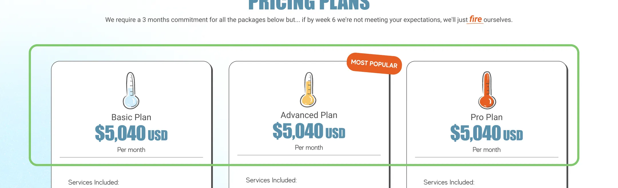
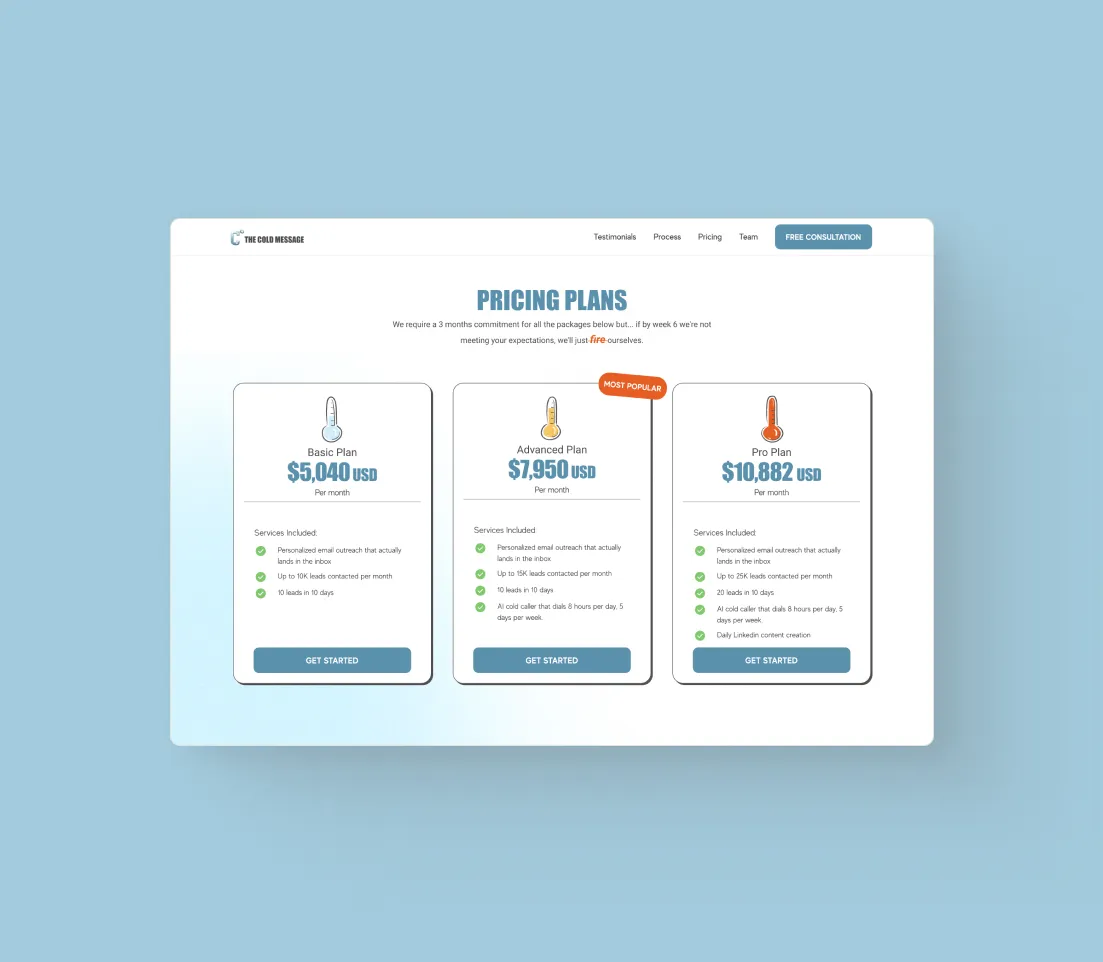
Thermometers for each tier of the plans act to visually differentiate them and improve scannability.
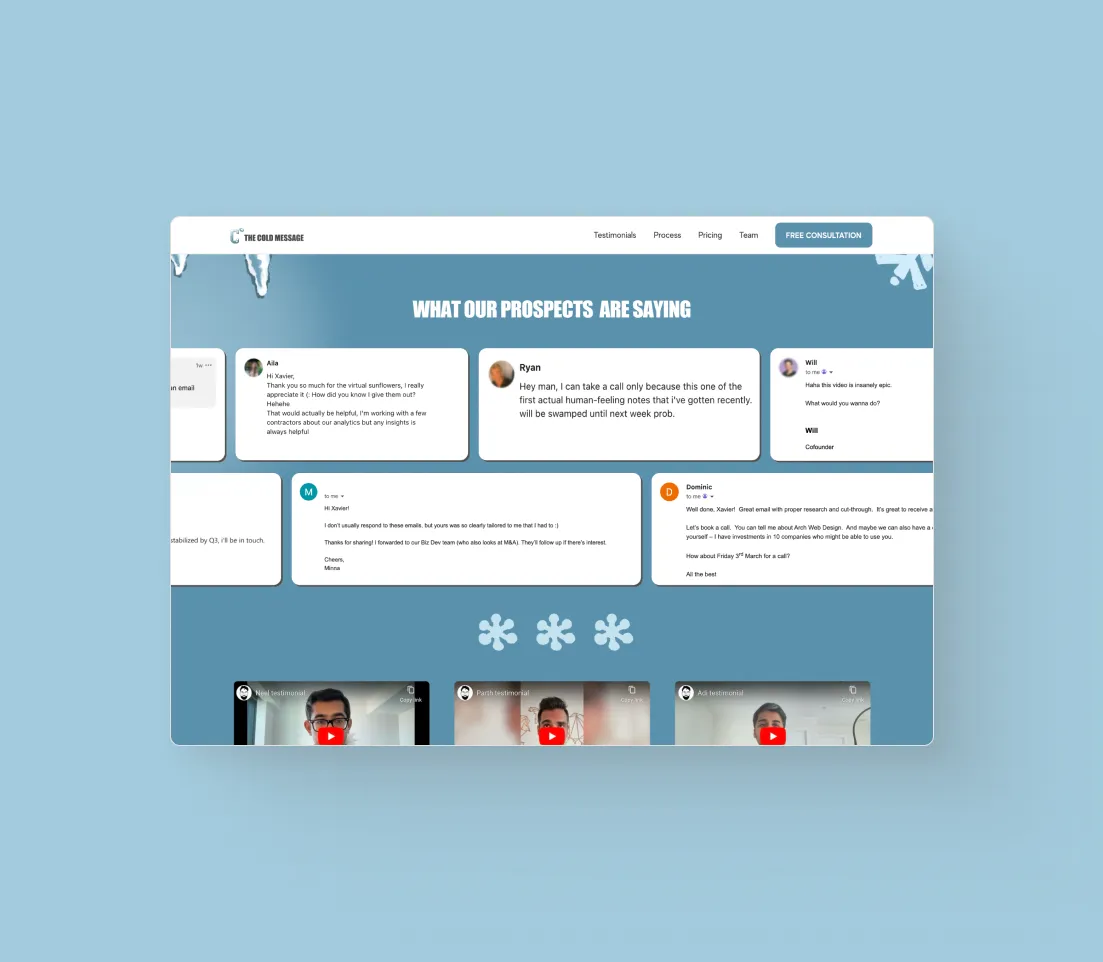
Outside of video and quote testimonials, a meeting booked counter above the calendly acts as a last push of social proof. If prospects weren’t convinced of the value that the agency can provide, meetings booked highlights the agency's bottom line.

3 ways my contributions impacted Xavier’s business
The landing page goes beyond aesthetics, proactively answering common questions 24/7. This approach also acts as a filter, ensuring that only clients aligning with their pricing reach - ultimately making it easier to book consultation calls.

First impressions matter, and the website highlights their accomplishments, illustrating their deep understanding of client needs. The social proof builds immediate trust with prospects from the start.

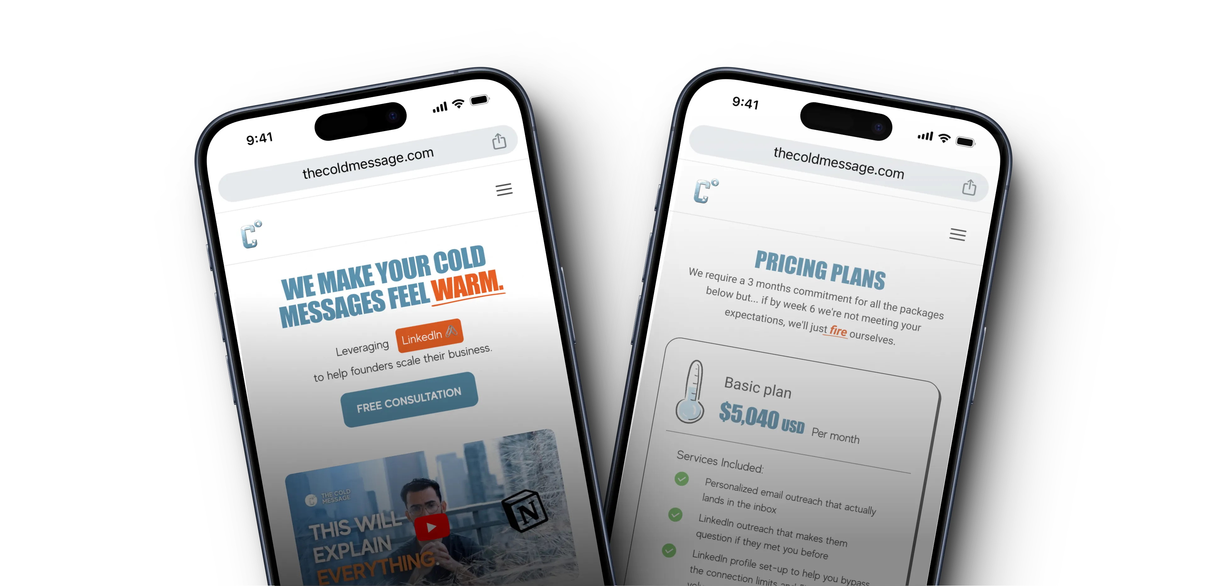
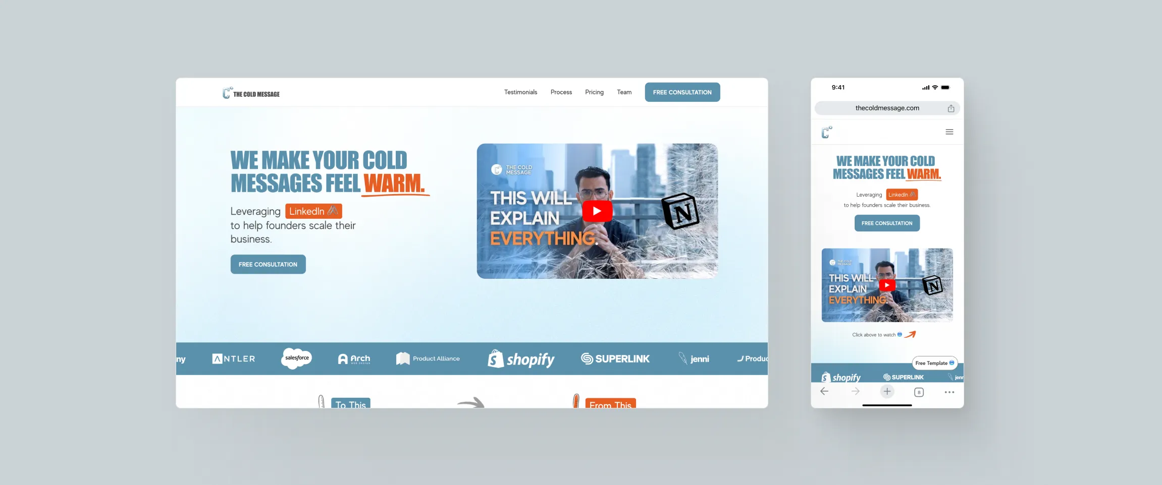
Creating a responsive website guarantees that users can easily access it, regardless of the device they are using. This is particularly crucial for prospects coming from LinkedIn, where the majority access content on mobile devices.

I’m in the process of renovating the detailed case study for this project. While the hard hats are on, feel free to explore my other other work.
During the summer of 2023, I had the privilege of interning at CGI, a global IT and business consulting leader with a rich history of serving over 50,000 clients since its establishment in 1976. The focus of my term was expanding CGI's Ascent design system. During my time I improved 7 components from the ground up. This case study will guide you through the comprehensive process of enhancing CGI's file upload functionality—an undertaking I spearheaded from inception to completion.
The Ascent design system:
Supports
Focusing on financial management solutions
Supports
CGI designers and devs
across the globe
Spans
Components and styles a within the design system
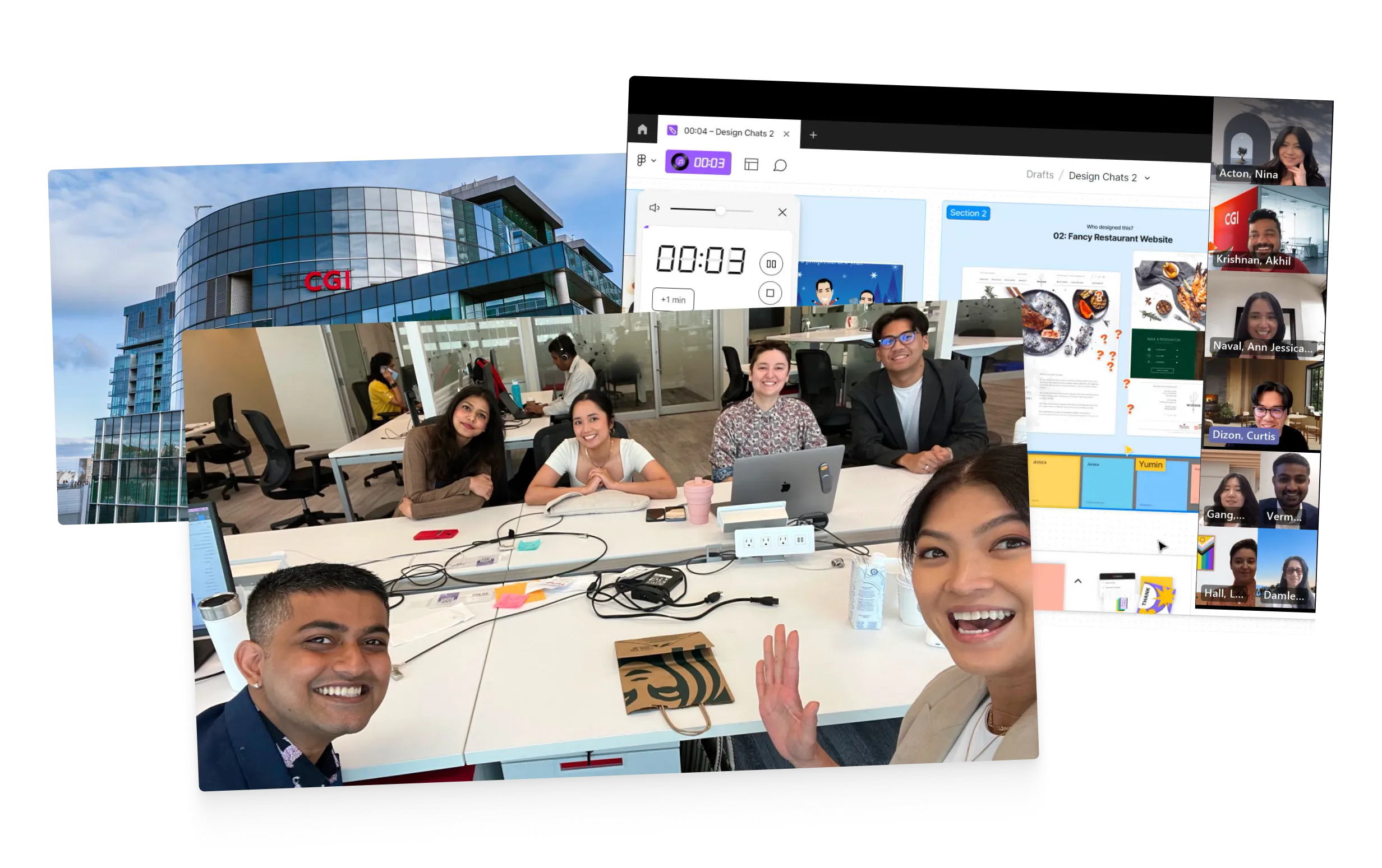
TEAM PICTURE
Throughout my design process I considered 2 major user group: end customers interacting with shipped CGI products and CGI designers/developers engaging with the file upload in the back end with Figma. These perspectives were crucial to ensure that the file upload feature not only met the immediate needs of end customers but also integrated into the design and development workflow of CGI's internal teams. Below outlines the significant tasks each user group performs with the file upload feature:
End Customers:
CGI Designers and Developers:
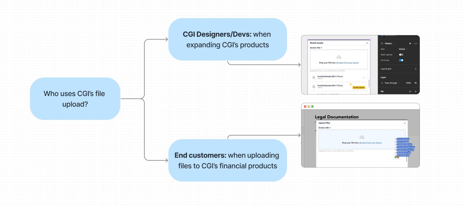
USER TYPES FOR THE FILE UPLOAD
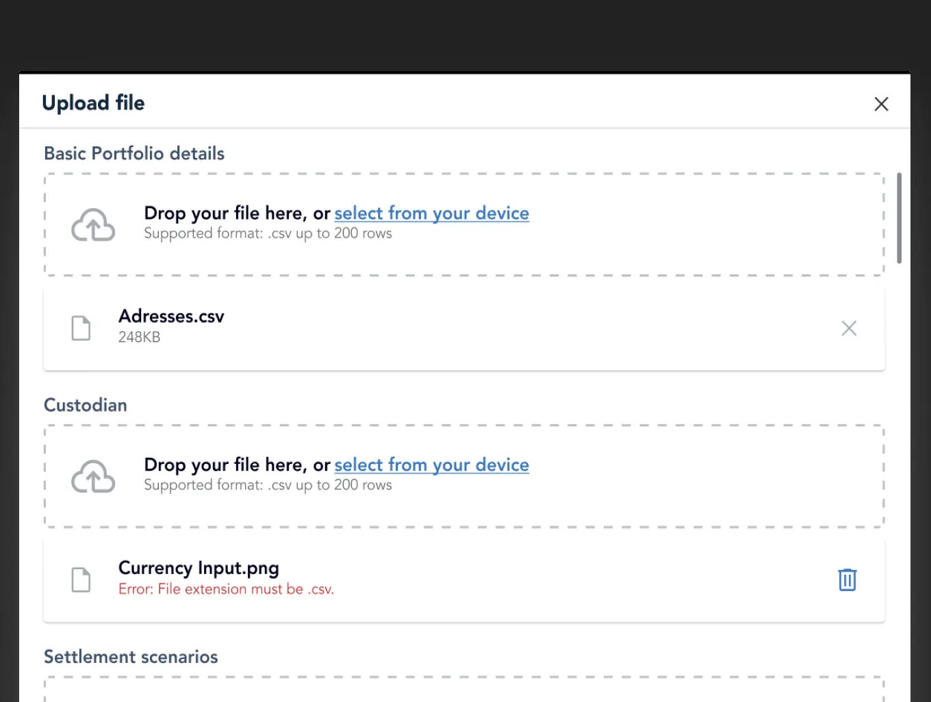
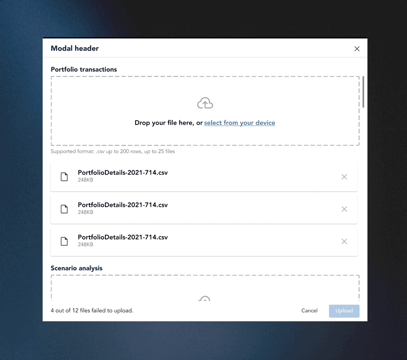
Issue: Users, such as Nick, faced challenges when uploading files across various categories to configure their products. The current design necessitated scrolling between upload sections, causing inconvenience, especially with a higher volume of uploads and potential longer onboarding times.
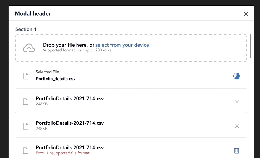
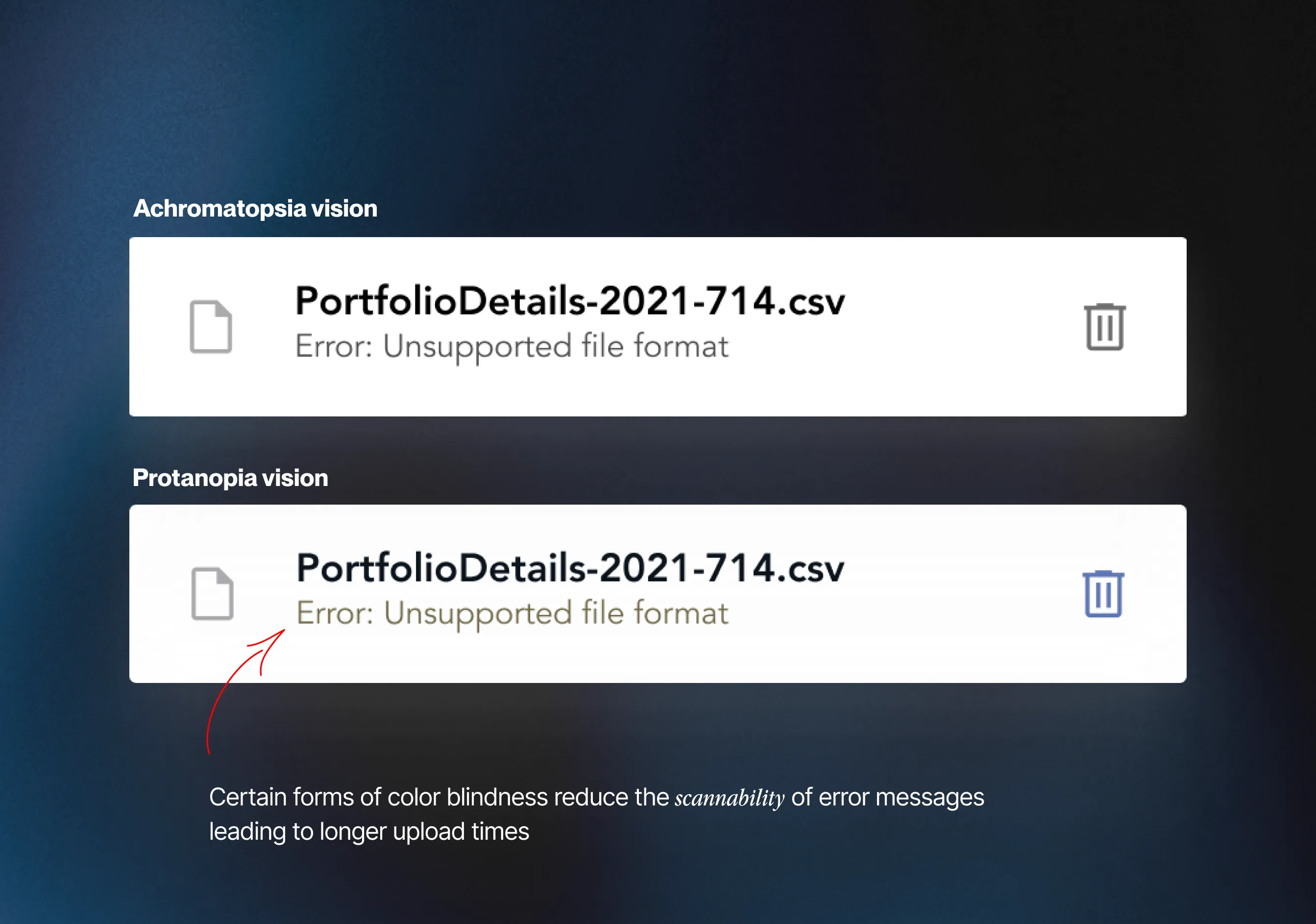
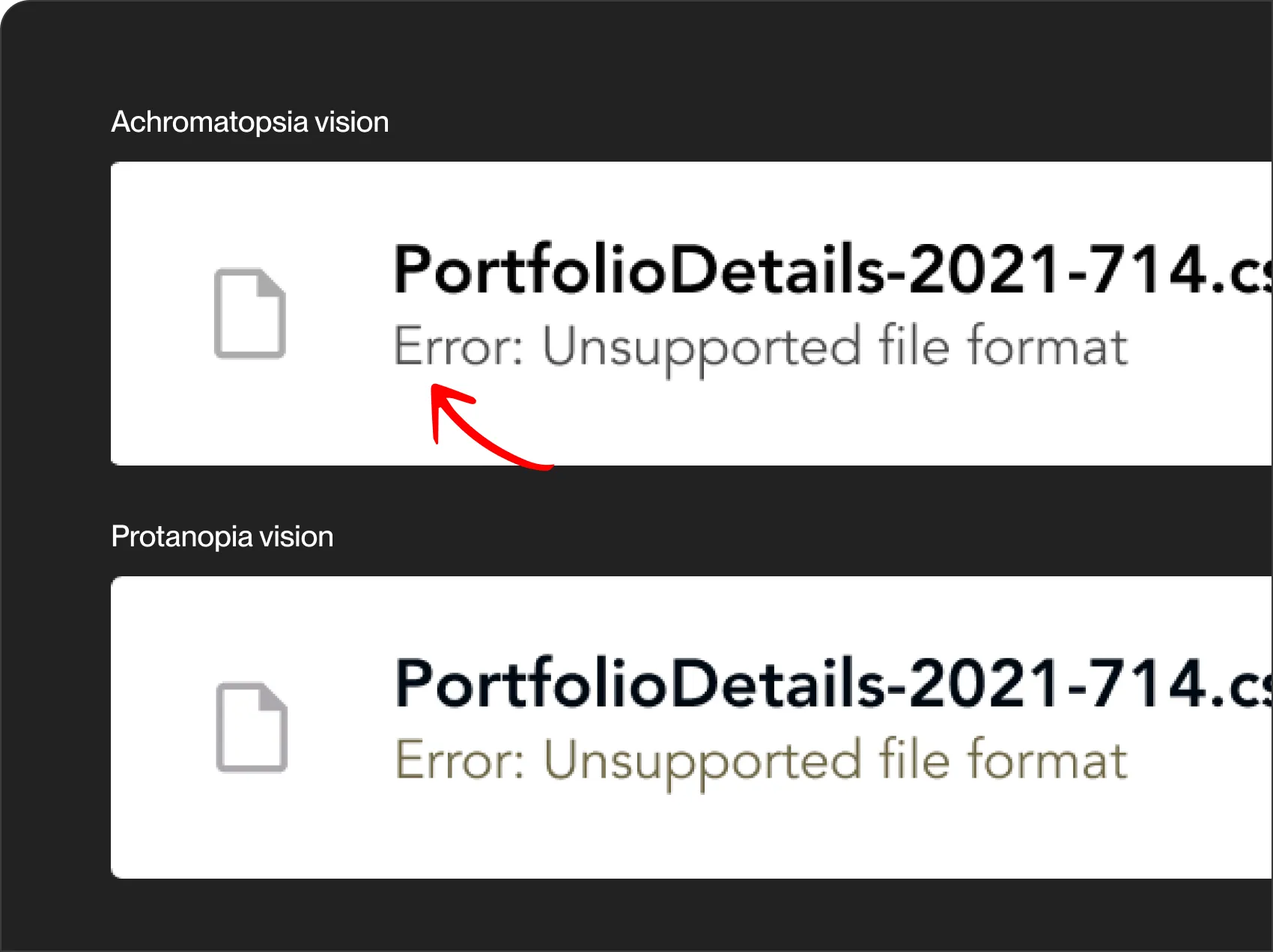
Some forms of color blindness diminished the visibility of the red hue in error text, making failed uploads difficult to identify at a glance. Additionally, successful and unsuccessful file uploads were denoted by identical icons, further complicating the distinction—especially cumbersome when managing a substantial number of uploads.
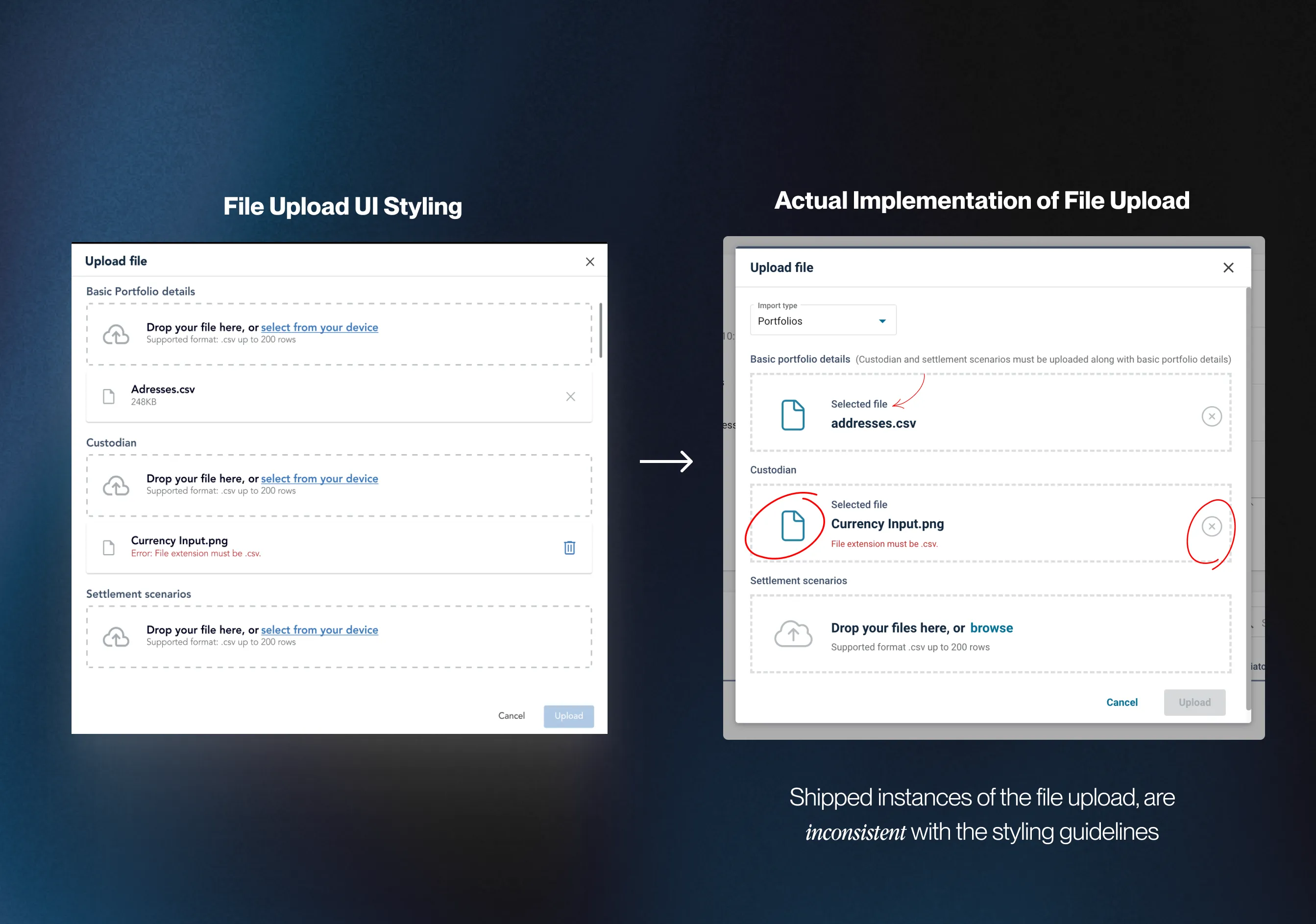
Instances of the file upload were not consistently implemented across CGI’s products, deviating from the specifications of the original design. Varied use of icons and layouts resulted in visual inconsistencies across platforms.

Some forms of color blindness diminished the visibility of the red hue in error text, making failed uploads difficult to identify at a glance. Additionally, successful and unsuccessful file uploads were denoted by identical icons, further complicating the distinction—especially cumbersome when managing a substantial number of uploads.
Instances of the file upload were not consistently implemented across CGI’s products, deviating from the specifications of the original design. Varied use of icons and layouts resulted in visual inconsistencies across platforms.
Issue: Users, such as Nick, faced challenges when uploading files across various categories to configure their products. The current design necessitated scrolling between upload sections, causing inconvenience, especially with a higher volume of uploads and potential longer onboarding times.
CLICK TO ENLARGE
This project marked my first time working on a design system. It was intimidating given its scale, but I came up with a 3 phase research plan to make it more manageable. The goal was to redesign the fil upload process and to do that i had to understand: CGI’s design system, how competitors handled their file upload process and any development constraints.
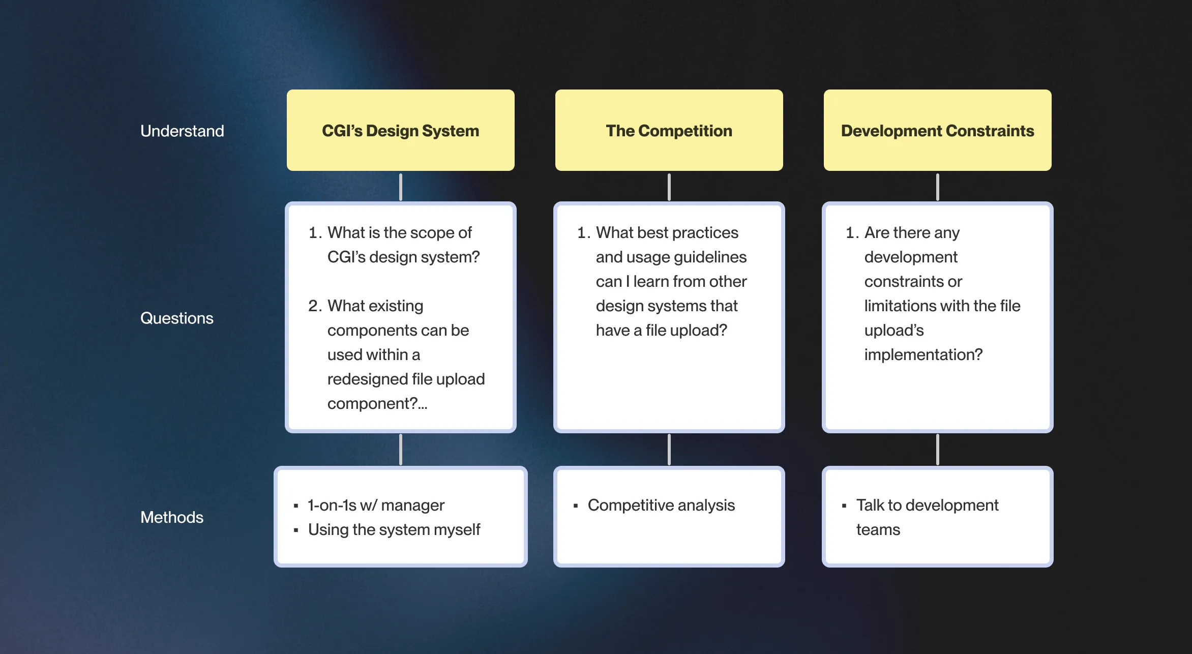
3 PHASE RESEARCH PLAN
When I joined CGI, their design department was going through changes like completing their transition to Figma and growing their design system. However, some components weren’t well-documented which was a major contributor to inconsistent development
The biggest constraint of the project was that file uploads had to be retained within a modal, as this was how it was already implemented.. Altering this approach would mean significant allocation of engineering resources. It was a case of "it is what it is," and we had to find a way to make the most out of this existing setup.
Looking at other design systems of similar maturity, I performed a competitive analysis to learn how these systems dealt with our 3 key challenges: spotting failed uploads, managing scalability, and keeping things consistent. Below is a summary of how they handled the problems:
I made a table that compared the UI of the competitors file upload component. A common theme was the use of iconography which improved scanability. However, when it came to handling uploads in multiple sections for scalability, no one had a clear example. It was a bit of uncharted territory.
To maintain consistency, I noticed that other design systems had design documents for their components. They covered everything from how things should look to the nitty-gritty details. CGI, unfortunately, didn't have something like this for file uploads. So, I took notes on how others did it – the styling, the structure, the dos and don'ts. These notes became my guide for making our design both seamless and well-documented.
Lorem ipsum dolor sit amet, consectetur adipiscing elit, sed do eiusmod tempor incididunt ut labore et dolore magna aliqua. Ut enim ad minim veniam, quis nostrud exercitation ullamco laboris nisi ut aliquip ex ea commodo consequat. Duis aute irure dolor in reprehenderit in voluptate velit esse cillum dolore eu fugiat nulla pariatur.
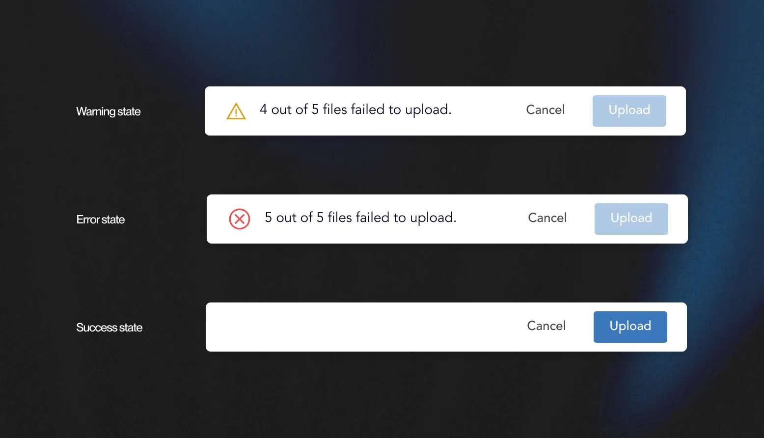
Highlighting failed/errors in file uploads through iconography enables users to quickly spot any issues, especially when dealing with lots of files.
The status of file uploads should always be visible so that users can instantly tell if files failed to upload. This eliminates the need for users to scroll to check for upload errors.
Expanding the dropzone area enhances accessibility for a broader user base, including those with motor or visual impairments. A bigger dropzone makes it easier for users to drag and drop files.
Placing upload specifications outside the dropzone aligns with standard form and input field design practices. Jakob’s Law states that users are accustomed to finding instructions and guidelines outside input fields, making the design more intuitive. This approach also offers flexibility in the amount of instructional content provided.
Before diving into design, I took a step back to map out the journey that end users would take during file uploads. I split their path into 2 scenarios: a straightforward single-section and the more complex multi-section uploads. Doing this allowed me to identify the various instances (ex: errors, successes and warnings) that I needed to design. From here, I used my learnings from my 3 phases of research to make the first design.

FILE UPLOAD JOURNEY MAP
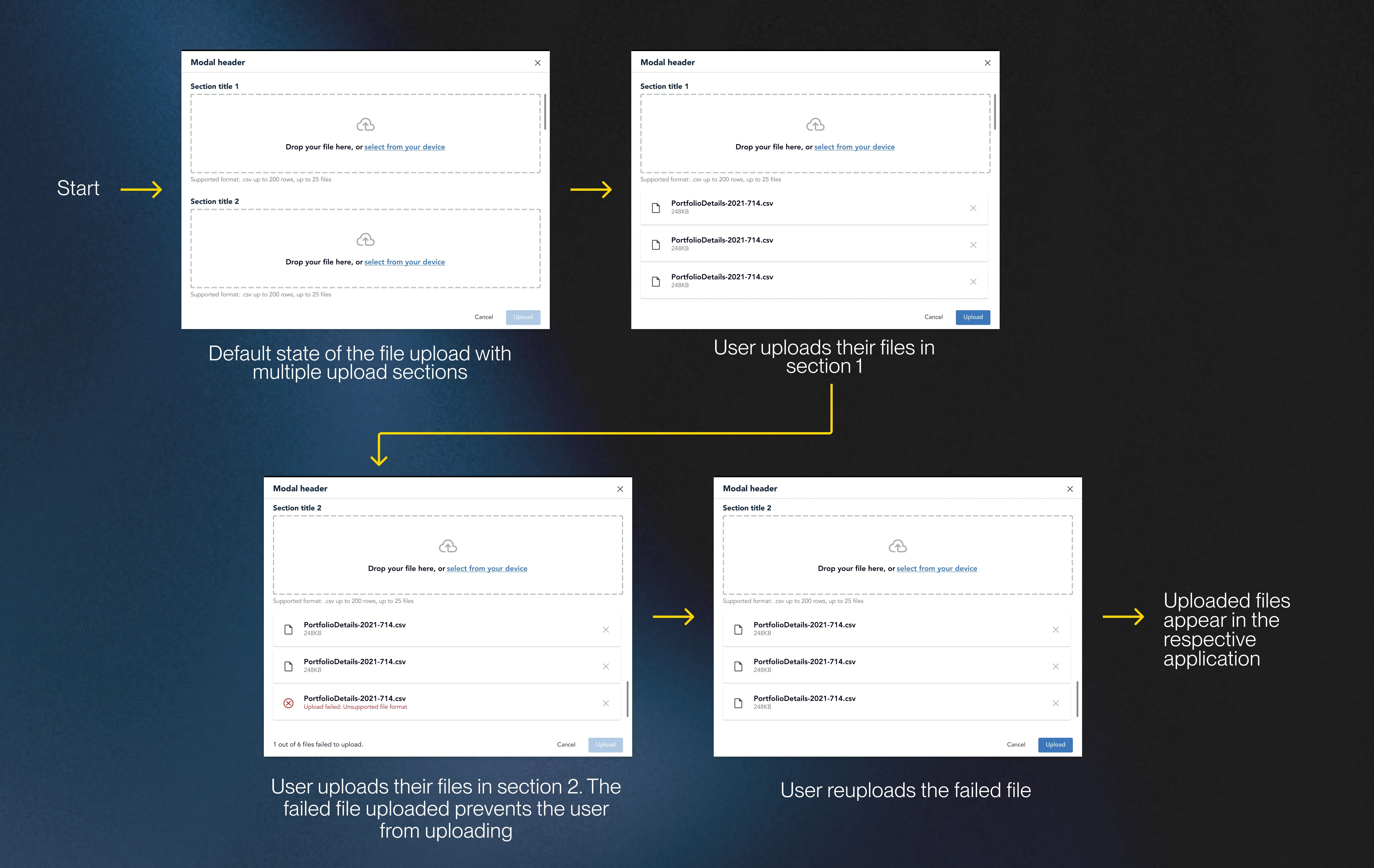
REDESIGN 1 FOR THE FILE UPLOAD
Unlike other companies, CGI’s design department has a limited budget for user testing, typically reserved for high fidelity product prototypes. As a compromise, our team uses critique sessions to test designs and get actionable feedback. In total, I tested my first design with 7 users, during which I gained 2 pieces of key feedback.
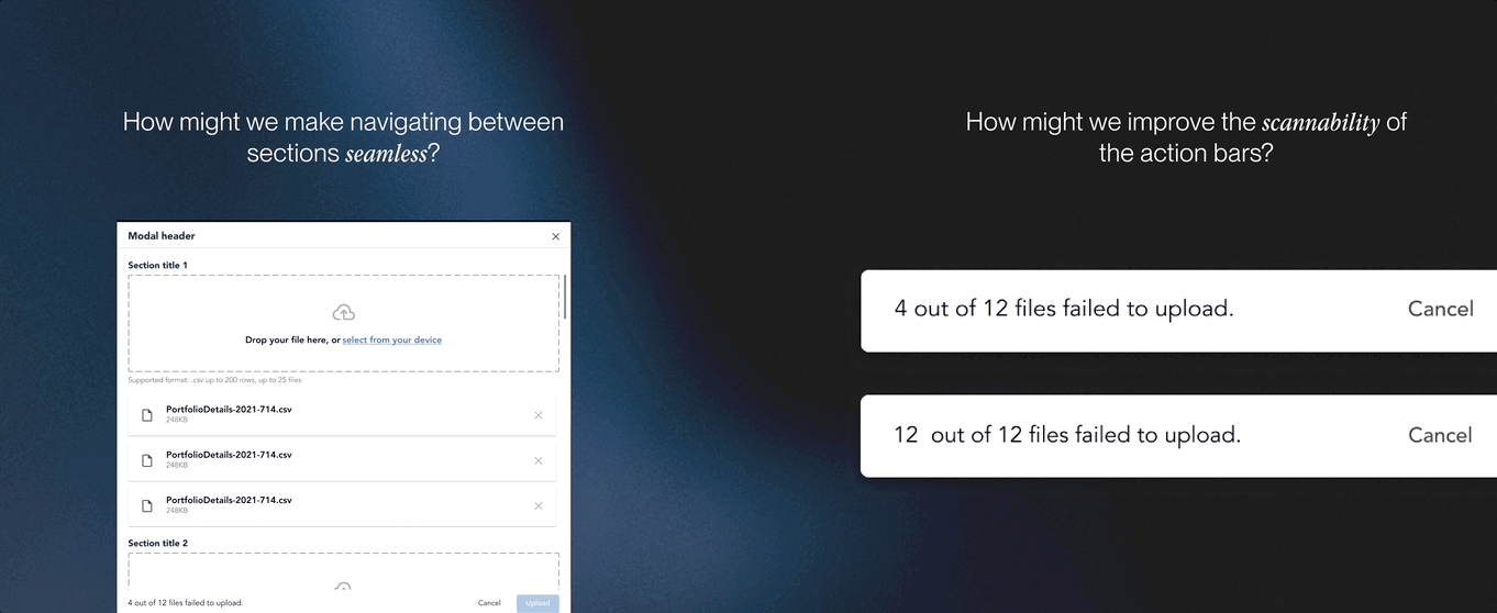
Extended scrolling still persists:
“Maybe there’s a way to bring more attention to the bottom message for the action bar? The updated icons on the uploaded files are great and I think we can use a similar visual language for the action bar.”
Action bar visibility
“The bigger dropzone is a great addition but I think the issue of potentially scrolling for a long time is still present. As a result, users can’t easily switch between the upload sections. I recommend looking at our tabs or dropdown component.”
Unlike other companies, CGI’s design department has a limited budget for user testing, typically reserved for high fidelity product prototypes. As a compromise, our team uses critique sessions to test designs and get actionable feedback. In total, I tested my first design with 7 users, during which I gained 2 pieces of key feedback.
Recognizing the challenge of section navigation, I introduced a toggle switch for seamless transitions between file upload sections.I chose this option instead of a dropdown so that users could efficiently change sections in 1 click as opposed to 2 clicks if it was a dropdown. Following the principles of the Gutenberg Principle ( Z-Pattern Layout), I strategically organized the modal layout, placing the primary CTA at the end of the flow guiding users to the next action.
My first design of the action bar didn’t distinguish its states. To better improve the visibility of the system status I added icons to the receptive action bar states, which were consistent with the icons that I was already using within CGI’s design system.

Lorem ipsum dolor sit amet, consectetur adipiscing elit. Suspendisse varius enim in eros elementum tristique. Duis cursus, mi quis viverra ornare, eros dolor interdum nulla, ut commodo diam libero vitae erat. Aenean faucibus nibh et justo cursus id rutrum lorem imperdiet. Nunc ut sem vitae risus tristique posuere.
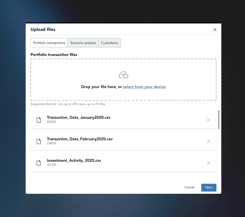
Putting all the pieces together, this is the redesigned file upload process for CGI! I made high-fi prototypes to demonstrate the flexibility of the components showing use cases for single and multi section file uploads.
.gif)
Considering my 2nd user group of the file upload (CGI Designers) I made tweaks using Figma’s variant and properties feature to allow our designers to easily customize the upload component - speeding up their iteration process.

MAKING QUICK CUSTOMIZATIONS WITH MY FINAL DESIGN
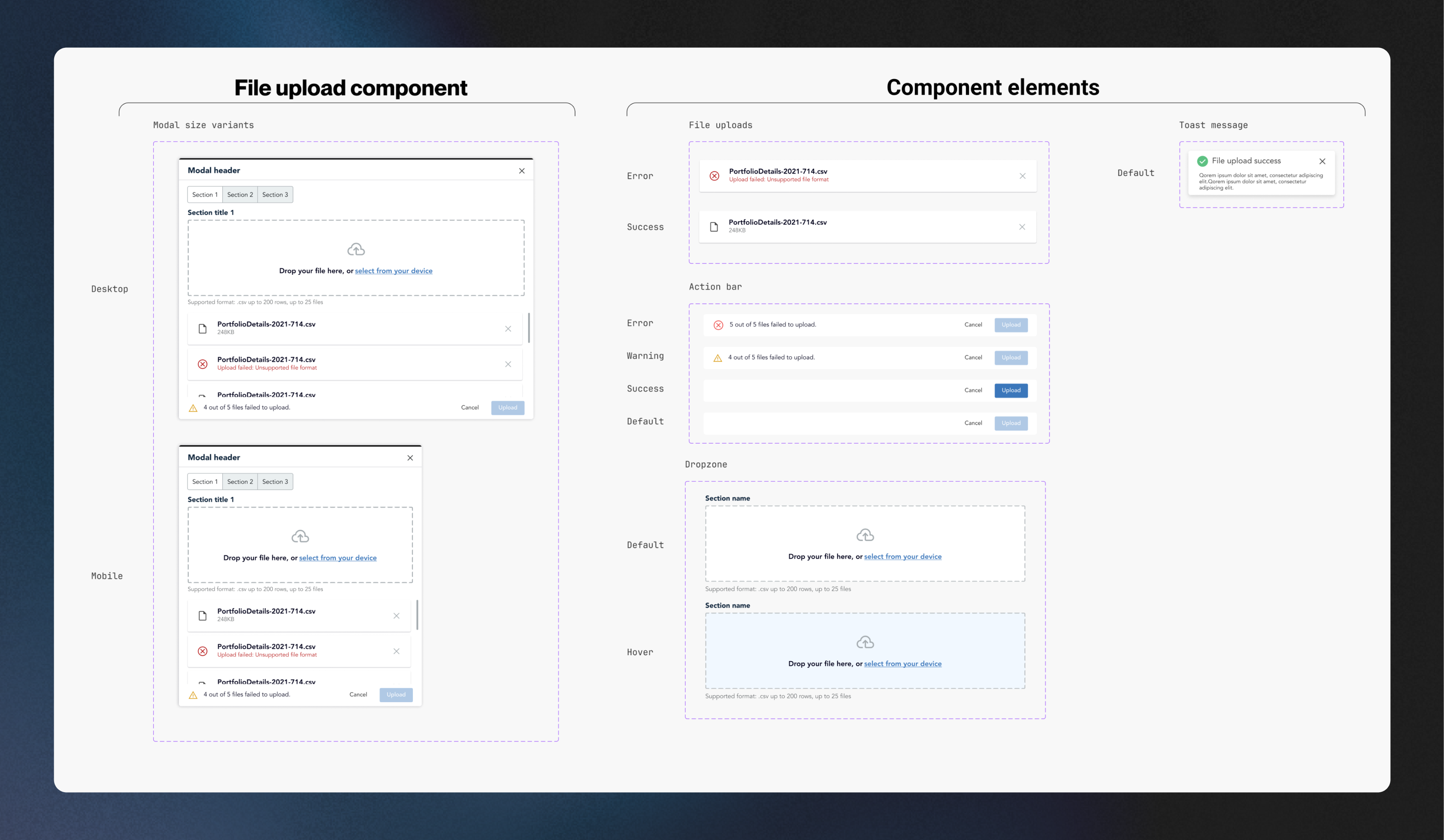
OVERVIEW OF ALL THE COMPONENTS/VARIANTS I DESIGNED
Recall that one of our main issues with the current design was that its implementation was inconsistent across our products. What was missing was a source of truth that designers, devs and PMs could refer to when implementing file uploads, So I developed a comprehensive usage and best practice guidelines to help our teams understand how to use the pattern even after my internship ended, I took inspiration from the usage documentation I discovered during phase 2 of the research.
FILE DESIGN DOCUMENTATION
In the summer of 2023, I interned at CGI, a global leader in IT and business consulting. During this internship, I played a key role in expanding their Ascent design system, which underpins seven products used by over 150 developers. This case study will take you through my journey of improving the file upload process, a project I spearheaded.
Increasing the dropzone area's height enhances accessibility, catering to a broader user base, including those with motor or visual impairments, making drag-and-drop easier.
Increasing the dropzone area's height enhances accessibility, catering to a broader user base, including those with motor or visual impairments, making drag-and-drop easier.
Increasing the dropzone area's height enhances accessibility, catering to a broader user base, including those with motor or visual impairments, making drag-and-drop easier.
In the summer of 2023, I interned at CGI, a global leader in IT and business consulting. During this internship, I played a key role in expanding their Ascent design system, which underpins seven products used by over 150 developers. This case study will take you through my journey of improving the file upload process, a project I spearheaded.