CIBC Business banking dashboard / INTERNSHIP / feb - apr 2023
Transforming an outdated dashboard to align with modern user experience standards.
[Problem] For over 7 years, CIBC's business banking dashboard remained stagnant, failing to align with their evolving design system. [Insight] This state not only caused accessibility challenges but also positioned CIBC behind industry competitors. [Solution] We proposed an extensive dashboard redesign backed by competitive research and insights from over 40 user tests.
Team
Simon Liu – Sr. Design Manger / Chrissy lee – Sr. Design / AaronLeach – Sr. Designer
CONTRIBUTIONS
Conducted 20 User tests / Competitive research / Wireframing / High-fi Prototyping / Presented designs to PMs
TOOLS
Figma / Usertesting.com
Timeline
Jan - Apr 2023
3 ways the redesign impacted CIBC's Commercial Business Payments Technology team.
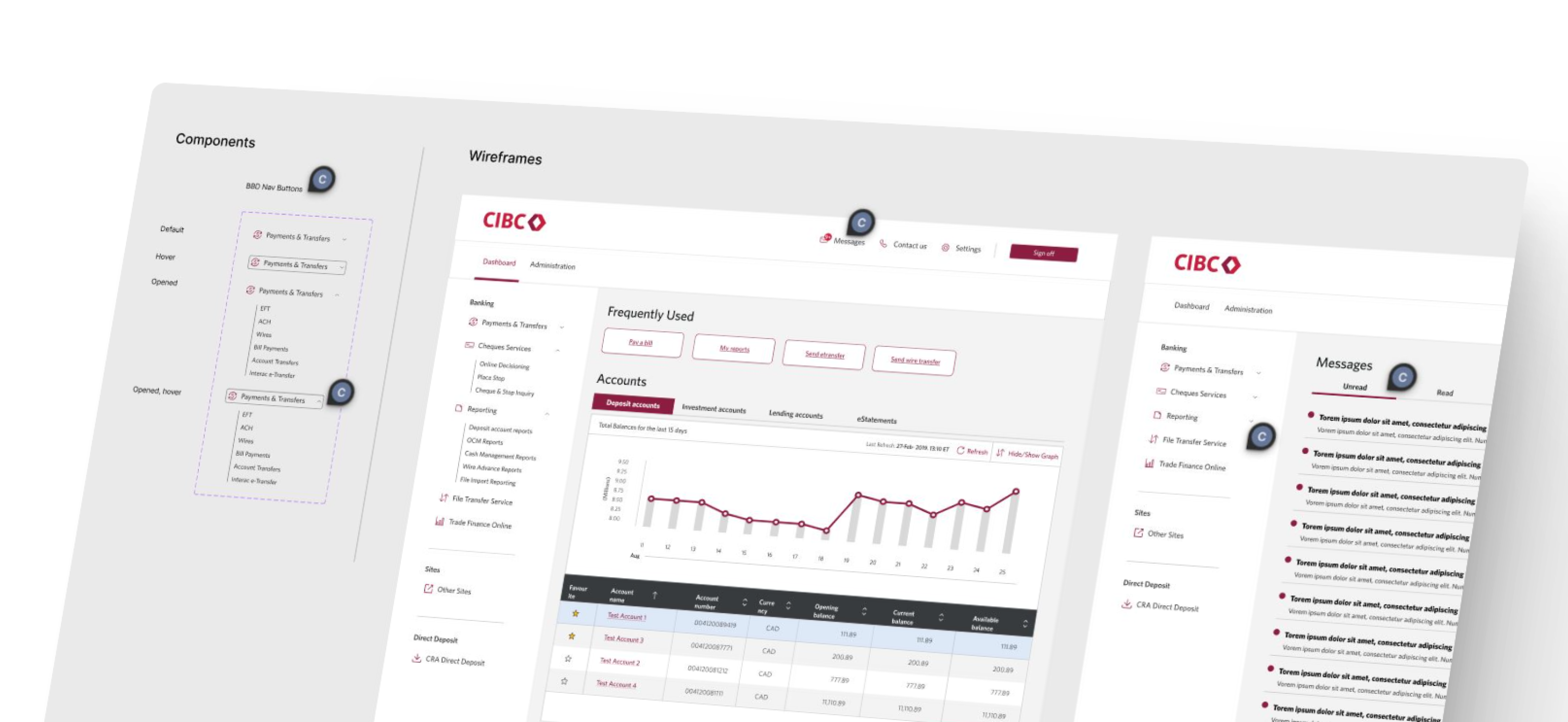
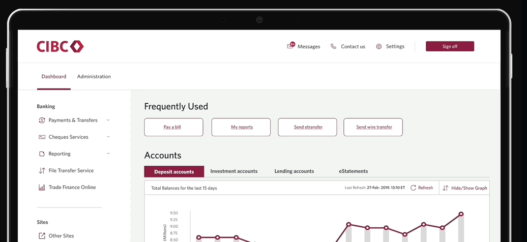
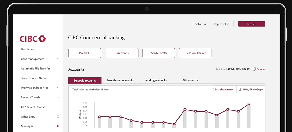
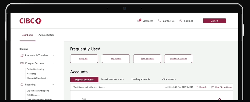
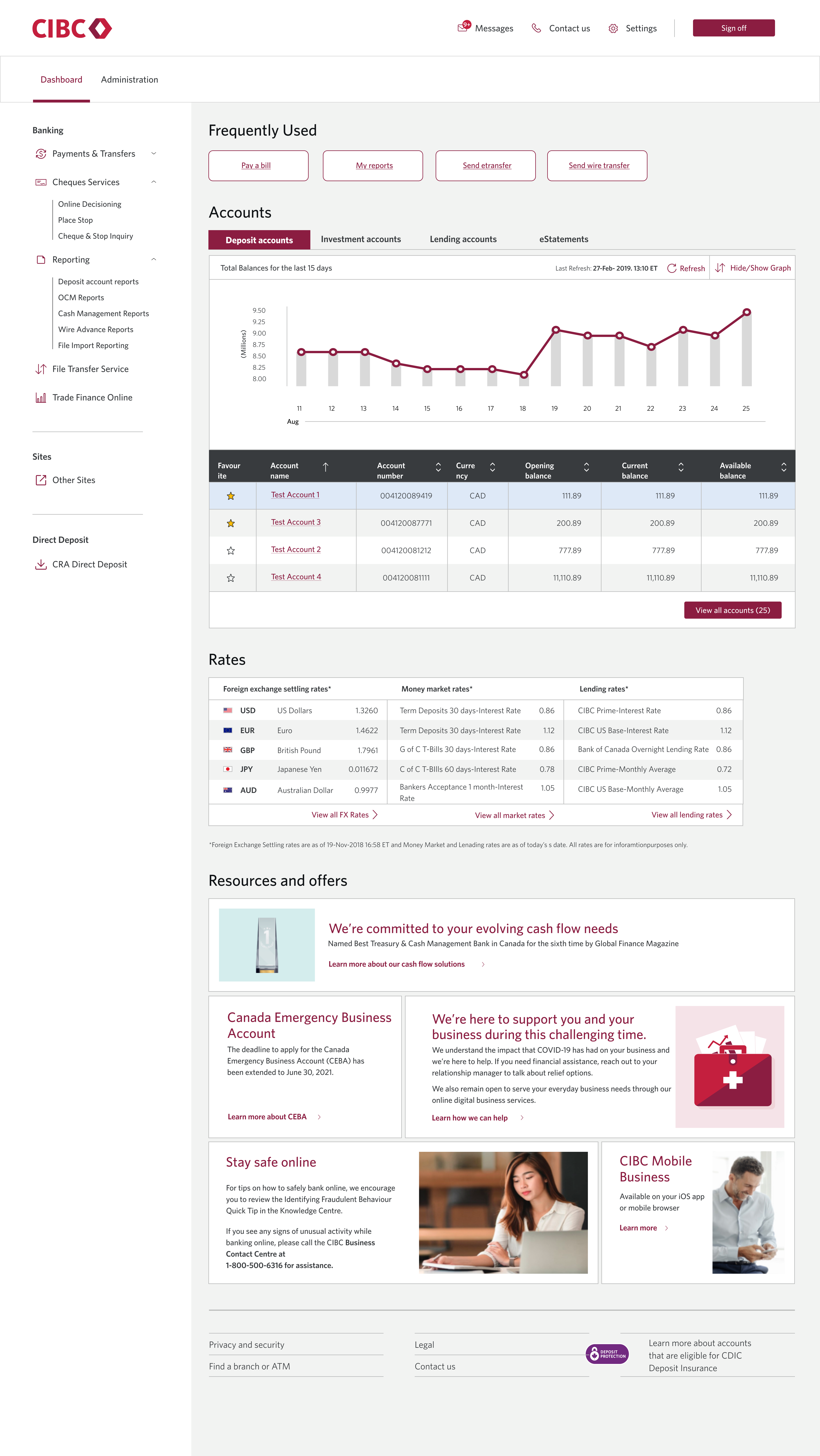
Based on 40 user tests, the dashboard shifted from a horizontal to a vertical navigation bar to facilitate better grouping of categories, improving overall navigation on the platform. Additionally, a frequently used section was incorporated, contributing to the streamlined productivity of the dashboard.
The last step in my design process was to handoff my designs to the developers. To ensure a smooth transition, my wireframes implemented CIBC’s design system of reusable components. I explained each interaction in detail to ensure that developers understood how the designs worked even in my absence.


In the summer of 2023, I interned at CGI, a global leader in IT and business consulting. During this internship, I played a key role in expanding their Ascent design system, which underpins seven products used by over 150 developers. This case study will take you through my journey of improving the file upload process, a project I spearheaded.
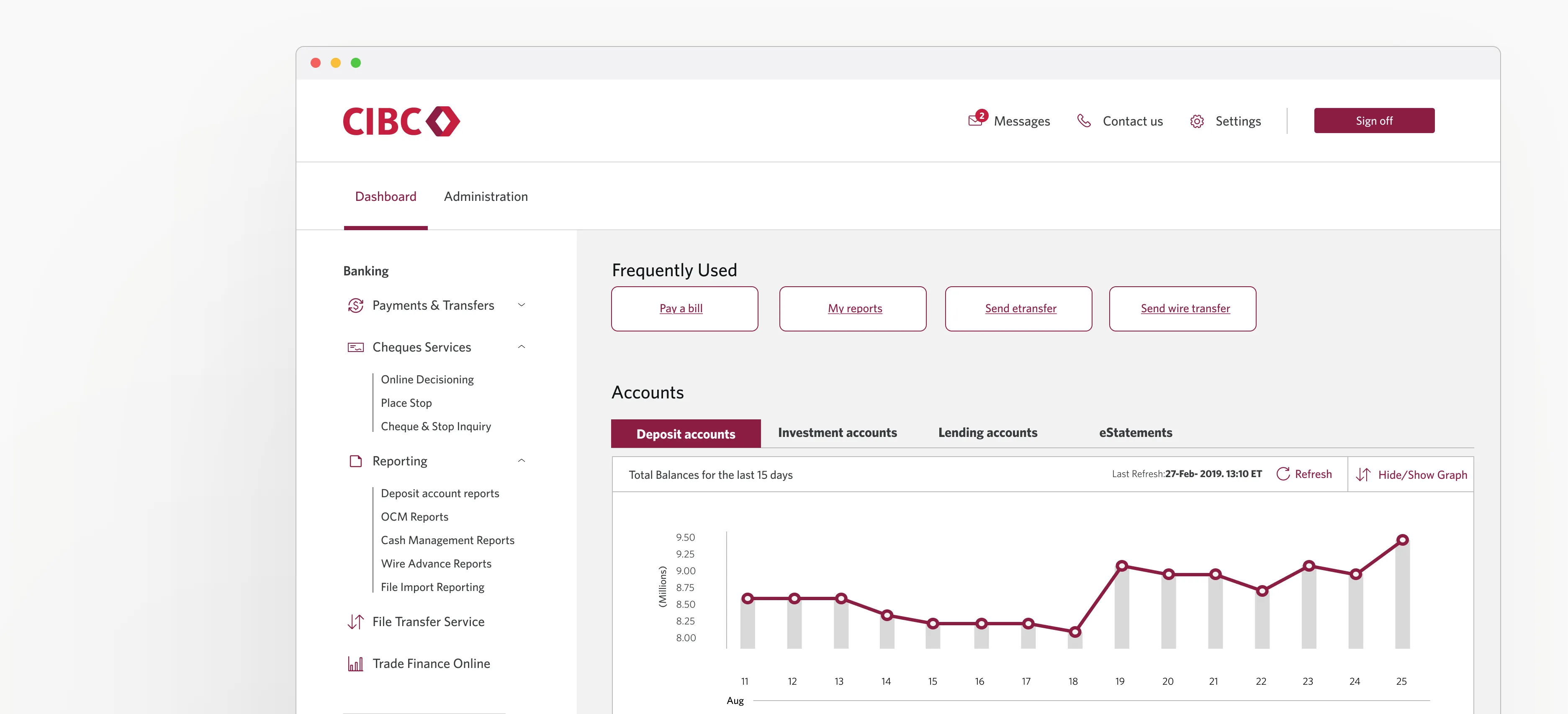
In January 2023, I joined CIBC’s business payments team as a UX Design intern. At the time, our department was beginning a complete UX overhaul of its legacy products. The focus of my internship was improving the Business Banking Dashboard (BBD) which Supports thousands of medium to large businesses across Canada.
BBD’s home dashboard helps businesses owners to:
of all of their account statues so that they’re always in the loop
Of their cash flows throughout all accounts so that owners know how much money is coming in and out of their business
TEAM PICTURE
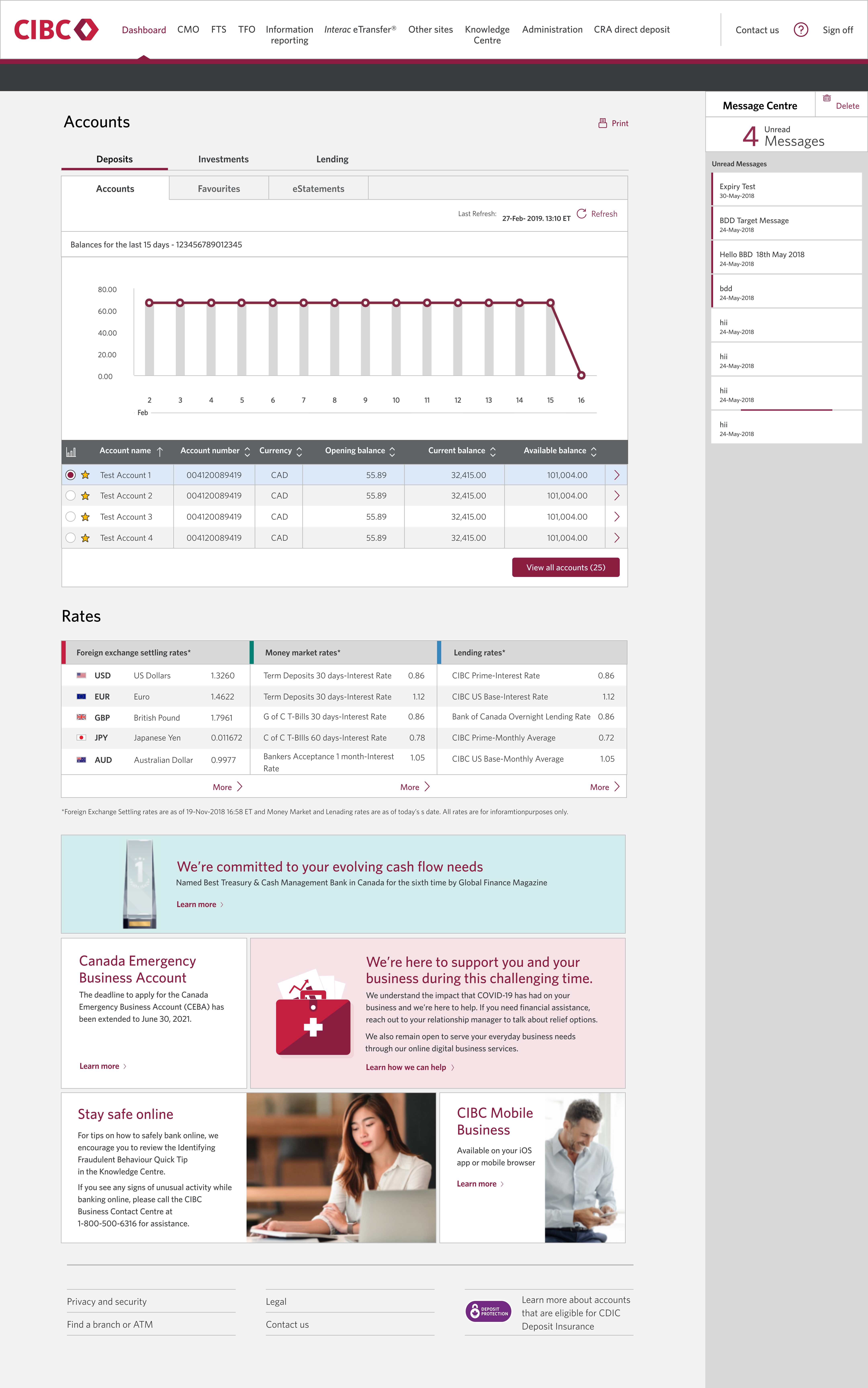
The BBD product was considered to be a legacy platform, not having been refreshed in 7 years. As a result, its design didn’t fully align with CIBC’s modern standards nor was it fully accessible. The Product Managers (PM) of BBD commissioned our UX team to begin a redesign of the dashboard because its current design suffered from the following issues:
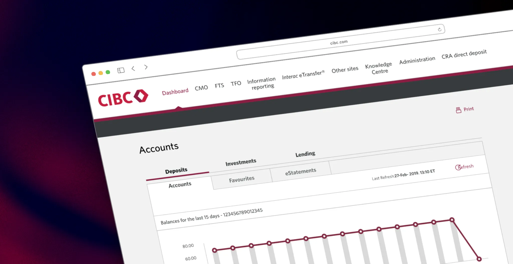
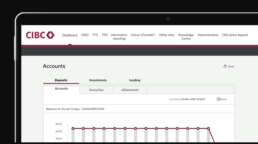
The horizontal navigation bar suffered from spacing constraints.Longer menu category names spilled onto 2 lines and adding new categories wasnot possible without hiding others. The French version was even worse becausegenerally, the French labels were longer than the English counterparts.
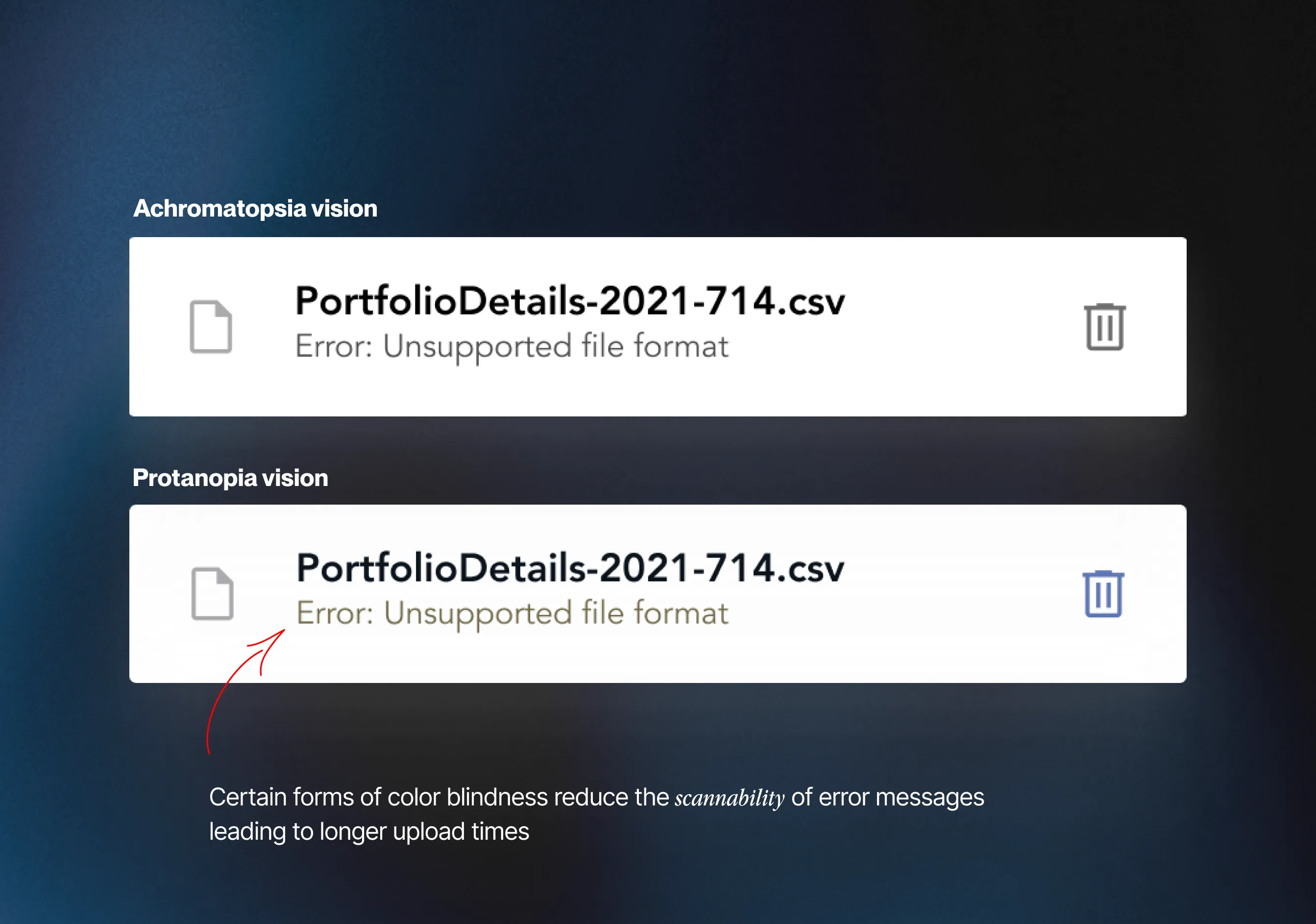
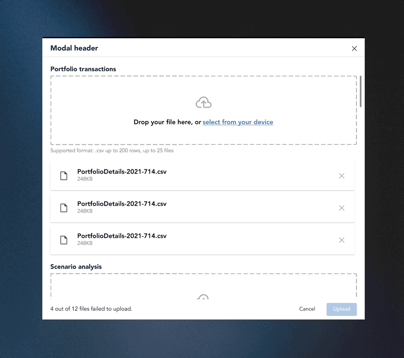
Some forms of color blindness diminished the visibility of the red hue in error text, making failed uploads difficult to identify at a glance. Additionally, successful and unsuccessful file uploads were denoted by identical icons, further complicating the distinction—especially cumbersome when managing a substantial number of uploads.
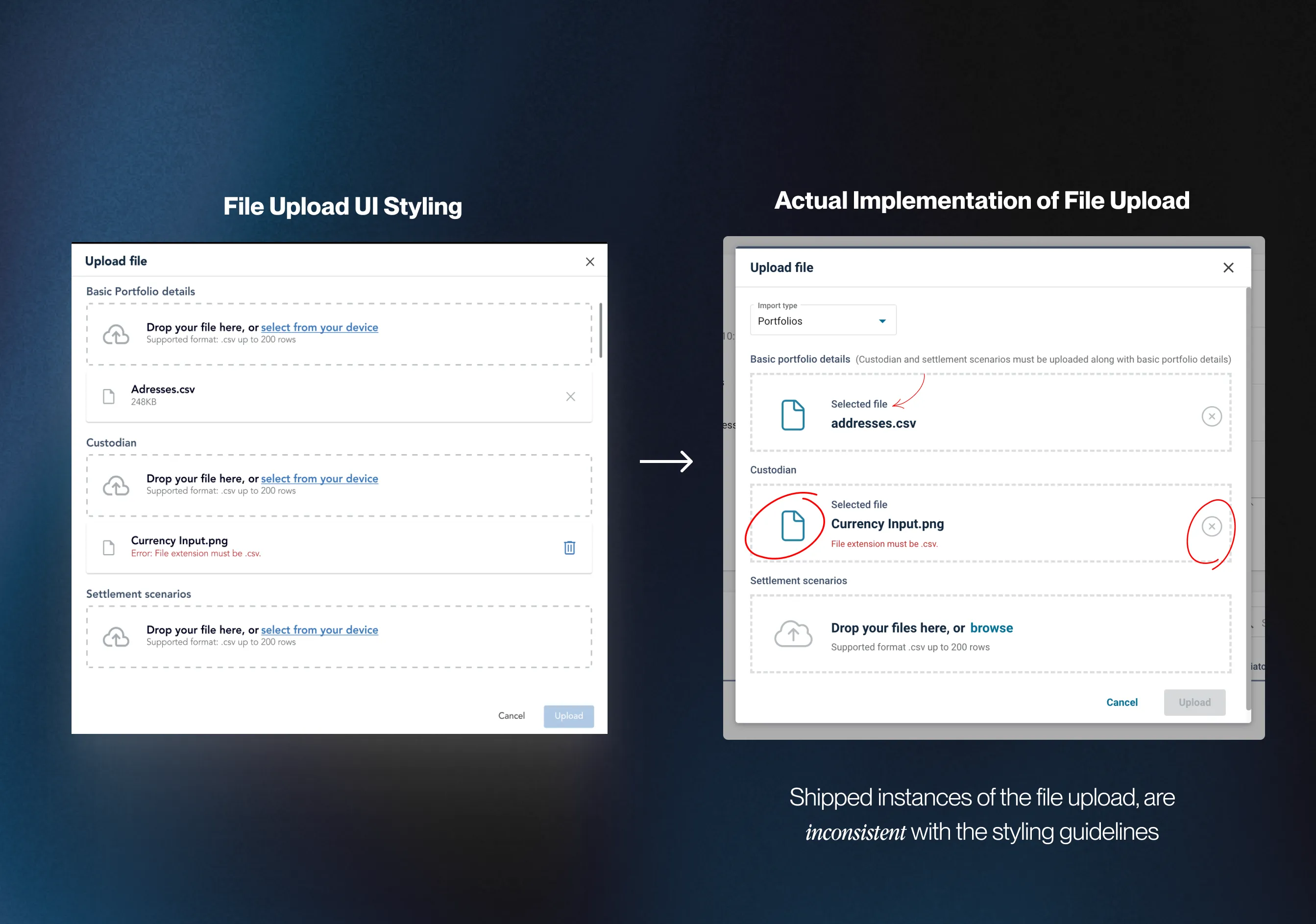
Instances of the file upload were not consistently implemented across CGI’s products, deviating from the specifications of the original design. Varied use of icons and layouts resulted in visual inconsistencies across platforms.
Issue: Users, such as Nick, faced challenges when uploading files across various categories to configure their products. The current design necessitated scrolling between upload sections, causing inconvenience, especially with a higher volume of uploads and potential longer onboarding times.
CLICK TO ENLARGE
This was my first project within the banking industry, and in all honesty I was unfamiliar with the jargon used around BBD, there were many acronyms to get familiar with. To better approach the project I developed a research plan where I outlined knowledge gaps that had to be filled so that I could make informed design decisions. To successfully redesign the BBD I knew I had to dig deeper into the problems with the dashboard and what competitors are offering.
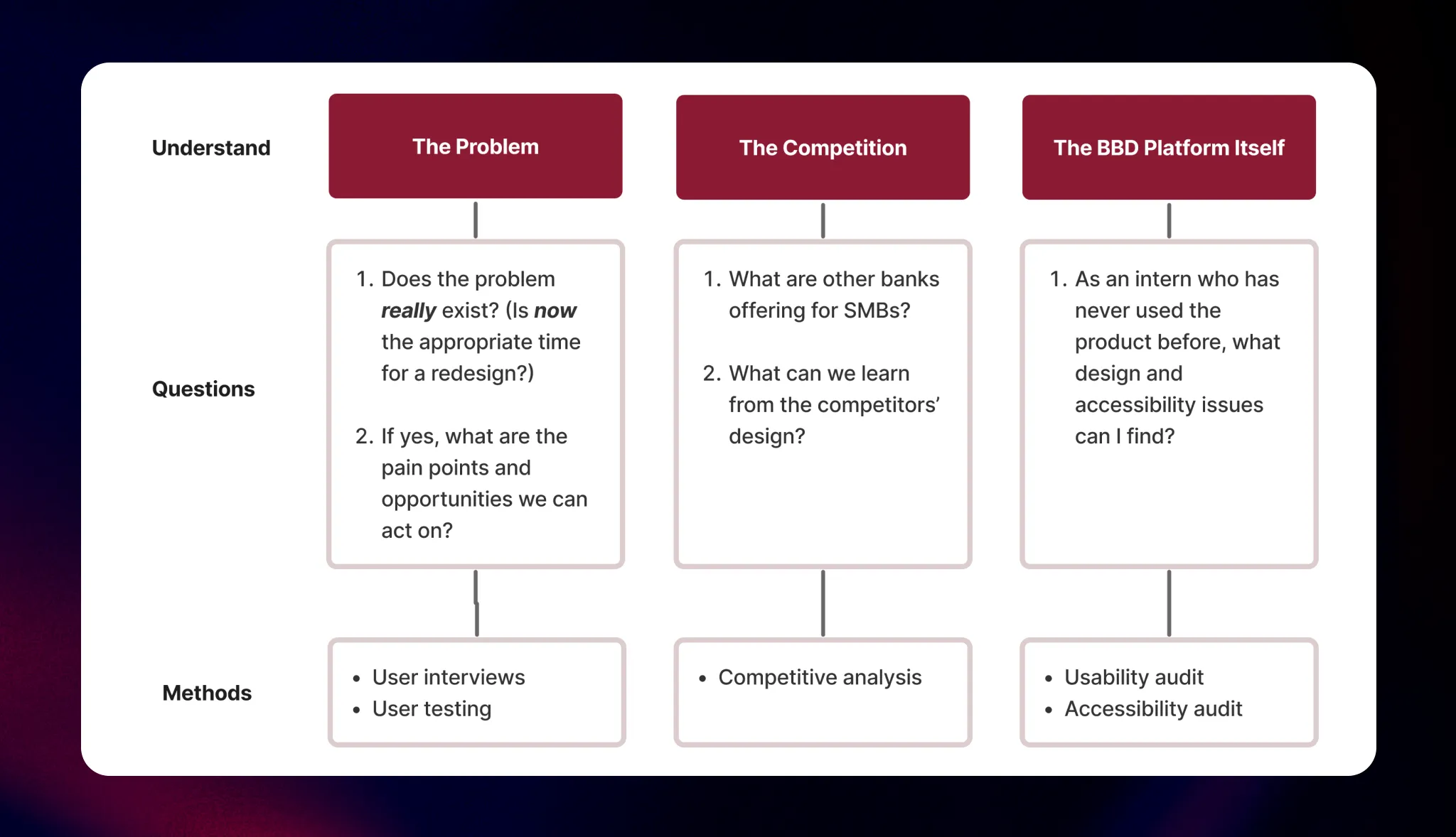
3 PHASE RESEARCH PLAN
One major design change our PMs advocated for was transitioning the horizontal nav bar to a vertical one. Recognizing the potential impact of such a radical shift, our team wanted to validate this design decision with our customers before implementation. Shadowing my teammate Chrissy, she conducted user testing to figure out what navigation design our users liked the best.
Testing insight:
Preferred the vertical navigation rather than the current horizontal one.
Testing insight:
Preferred drop-down categories rather than fly out ones in a vertical navigation menu

3 PHASE RESEARCH PLAN
Next, I conducted a competitive analysis among the big 4 Canadian banks. This allowed me to identify feature gaps in CIBC’s product and understand how the competitors are dealing with our own problems, mainly navigation and dashboard organization.
While CIBC shares a majority of features with other big banks, I discovered that we were missing a quick links feature on our dashboard. This could potentially improve the overall UX of the dashboard and my manager suggested I share the insights with our product team.

3 PHASE RESEARCH PLAN
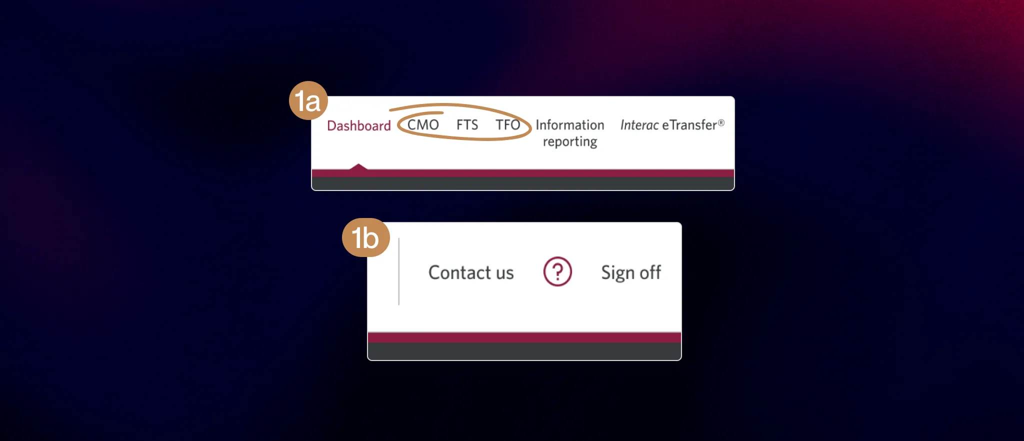
To round off my research I conducted a UX audit of BBD. This was a great opportunity because I would be looking at the dashboard as a first-time user. The goal was to access the dashboard's accessibility, visual design and overall functionality. Below is a summary of my main findings
1a). As a new user, I didn’t know what CMO, FTS or TFO meant as they aren’t common acronyms.
1b). The function of the “?” is unclear, it didn’t lead to the contact us section as that button is beside it.
3 PHASE RESEARCH PLAN
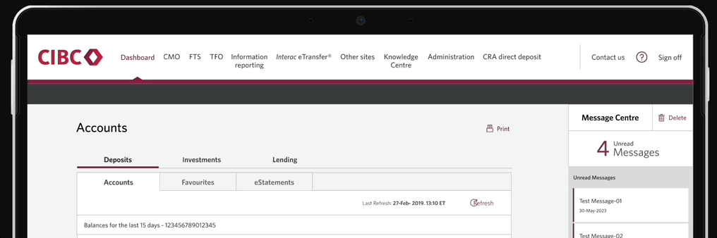
3a). Users are not provided with a visual indicator to determine if they have a new message. Which is important to have because the section is hidden by default.
3b). There is an absence of contrast between read and unread messages which may confuse users who has visual impairments

3 PHASE RESEARCH PLAN
6) The background colour on the ads gives off the impression of a visual hierarchy, with the red background being more important than the others, even though they’re equally important. The section also doesn’t have a title which is inconsistent with the rest of the dashboard.

3 PHASE RESEARCH PLAN
After figuring out what to put into the first draft of the redesign from the previous steps, my manager suggested showing our PMs high-fi wireframes for feedback. In all honesty, this drifted away from my usual process. Normally I'd create lo-fi wireframes or sketches and iterate from there but I had to admit, showing non-designers unpolished designs might not get my design ideas across effectively and most certainly won't get the buy-in we needed.

First iteration of BBD’s redesigned homepage
After presenting the initial redesigns, I walked away with 3 major pieces of feedback that I considered for my next iteration:
Disorganized information architecture: “The information architecture of the nav bar could be improved by grouping the menu items into related categories which we’ll help you with”
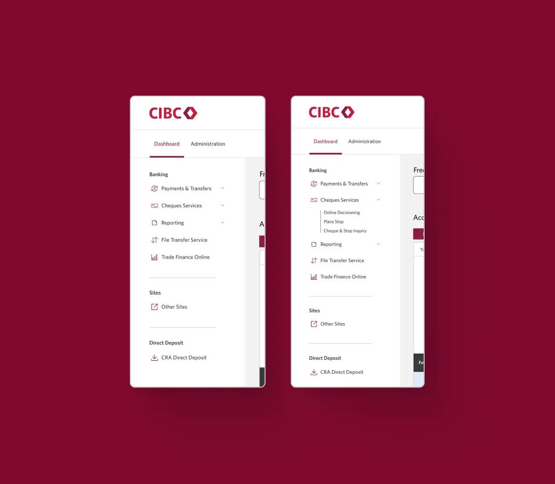
Design Rationale: Working alongside our PMs, they made edits to the information architecture of the nav bar by grouping related items into their own categories. Leveraging the law of proximity, I added further visual separation to separate the categories.
Design Rationale: Working alongside our PMs, they made edits to the information architecture of the nav bar by grouping related items into their own categories. Leveraging the law of proximity, I added further visual separation to separate the categories.
Disorganized information architecture: “The information architecture of the nav bar could be improved by grouping the menu items into related categories which we’ll help you with”
Design Rationale: PM feedback suggested that the message center tab wasn’t a necessary feature to have on a home page. This aligns with Hick's law, indicating that having fewer options on the homepage can facilitate quicker decision-making by users. To address this, we opted to relocate the message center to a separate page, considering that its existing design already required users to navigate to another page for complete message access. Additionally, to enhance user awareness, we introduced a number indicator on the message button to promptly notify users of unread messages.
Design Rationale: PM feedback suggested that the message center tab wasn’t a necessary feature to have on a home page. This aligns with Hick's law, indicating that having fewer options on the homepage can facilitate quicker decision-making by users. To address this, we opted to relocate the message center to a separate page, considering that its existing design already required users to navigate to another page for complete message access. Additionally, to enhance user awareness, we introduced a number indicator on the message button to promptly notify users of unread messages.
To validate whether excluding the dropdowns was the best design decision for the nav bar, I conducted user testing to see which style was preferred. We asked 10 general users and 10 users who identified themselves as working in financial services to complete the test to get diversified opinions.
Testing insight:
Preferred no dropdowns because the categories weren’t hidden.

3 PHASE RESEARCH PLAN
While the majority of users preferred removing the dropdown, I also wanted to take into account power users who are familiar with the platform and understand BBD’s information architecture. To find a compromise, I decided to keep the dropdown but have them open by default so that users can choose to close them after initially seeing all of the categories. This way, the design caters to both inexperienced and experienced users and provides flexibility.
Using the feedback from BBD’s product managers and the results from user testing, I made final edits to the dashboard’s design.
This experience marked my first corporate design project and I definitely learned throughout the process. I’ve outlined my top 3 takeaways below:
Engaging with non-designers can be challenging, yet it plays such a vital role in gaining buy-in for your design. This project taught me the importance of explaining my design choices by focusing on the essential information, rather than getting caught up in minor details that only fellow designers would grasp.
Working on a B2C product, I learned that the needs of the business and end user can conflict, compromising the user experience. However, I believe it's crucial to empathize with both groups, voice opinions, and make necessary tradeoffs.
When exploring various dashboard designs, I discovered diverse feedback from my manager, product managers, and other stakeholders. It became my responsibility to synthesize the feedback, prioritize essential changes, and make informed decisions based on my judgment and insights from our research.